Commercial spaces are increasingly taking more care of the image they show to their customers. Hotels, restaurants, shops and also medical clinics seek to welcome their visitors in welcoming, warm environments that convey well-being through interior design. That is why every detail, every material and every piece of furniture and lighting must respond to the same principle of elegance and harmony.
Interior designers must carry out an exhaustive study of the professional needs of each business and know perfectly the aesthetic tastes of the people responsible for the brand. Only in this way can we find a balanced image in line with the relevance that each company needs to differentiate itself from its competitors.
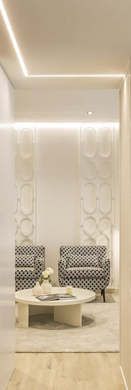
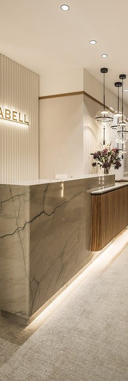
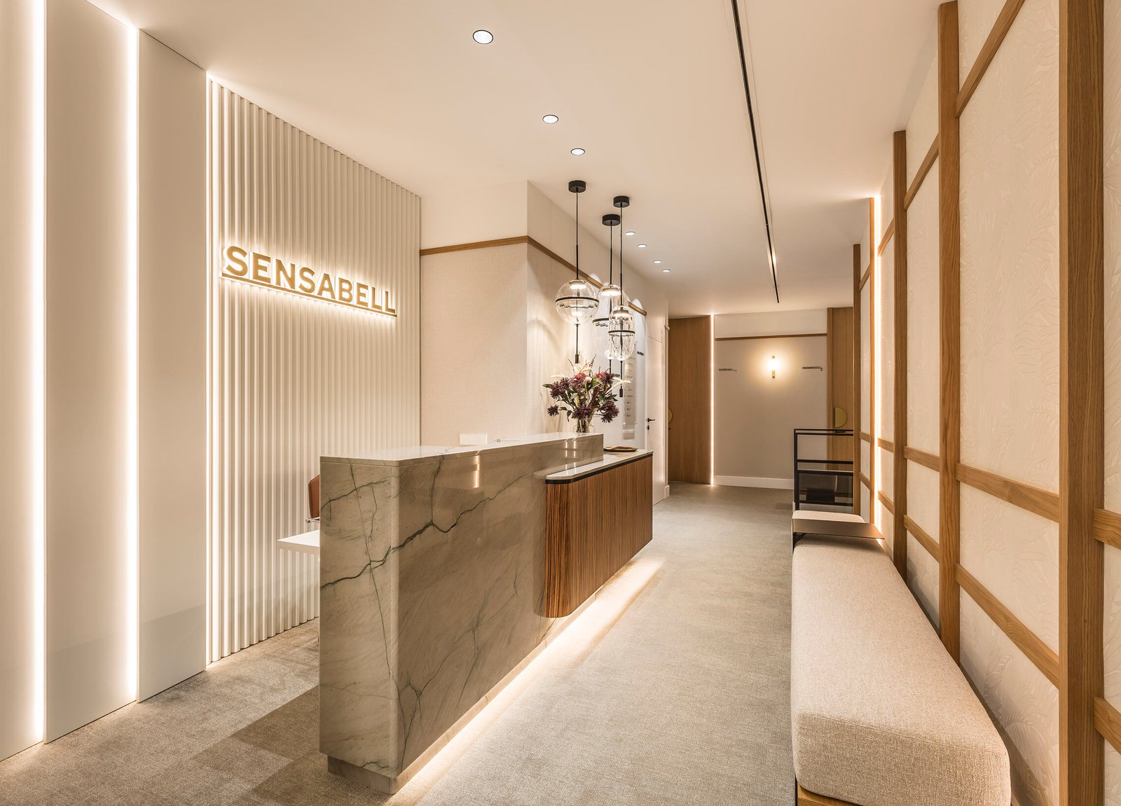
An example of this is the Sensabell Clinic in Valencia. A temple to beauty that started from an open space and whose design combines an efficient distribution, exclusive pieces of furniture and the richness of materials to achieve a cozy and unique image.
Starting from a square floor plan, a concentric square was created for the private area of the clinic. The rest of the rooms surround that space. This interior design facilitates circulation in both directions and makes the most of the space for offices and examination rooms.
No company wants to look like another. That is why it is important to have interior designers and decorators capable of providing a unique and exclusive image to the space.
Thus, in the reception area, a custom counter was designed combining grained zebrawood in contrast with the marble, matching the flooring. A mixture of cold and warm tones that represents a daring bet, an essential factor to differentiate itself in the field of aesthetic medicine clinics.

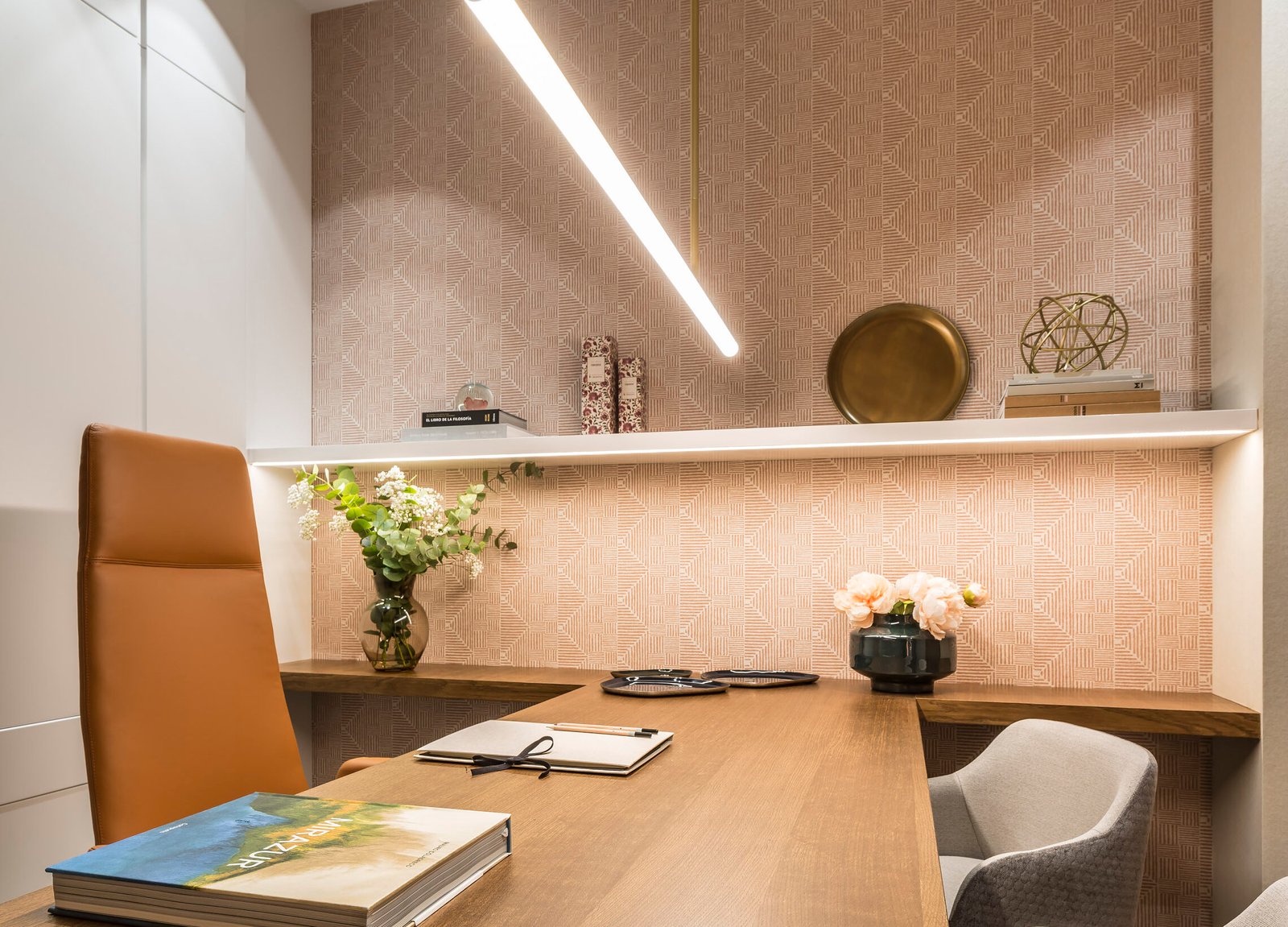
In the case of the three offices, they share furniture, but differ in the wall covering and the tones of the decoration to give them their own personality: geometric shapes, natural textures that evoke wood and powdery tones, respectively. This achieves a balanced, but not identical, style.
Another type of establishment that is also choosing to reformulate its interior design and decoration to be more attractive and welcoming are student residences such as, for example, the Colegio Mayor Universitario Mendel in Madrid.
In this case, the common spaces have been redefined from a minimalist proposal with oriental touches that fits into a study and concentration environment. Stylized and balanced spaces made of wood materials, smoked glass panels and panels covered in decorative papers in stone tones. The walls have been decorated with a system of joined wood, high-quality upholstery combined with cold and warm tones and studied lighting.
Interior design and decoration professionals must make careful decisions when approaching any project. The personality of the brand must be reflected in the details and the emotions they generate..


